
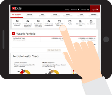
DBS iBanking, the bank with the largest consumer base in Singapore has recently revamped its website. I like that DBS has stated that “the future of banking is digital”. This appeals to geeks like Alvin and I who spend a lot of time online, whether on web or mobile or any other devices (by the way the new site is tablet friendly too!):

Banks going digital just makes so much sense to me. The other day when I was queuing to withdraw some fresh notes for Chinese New Year, it bothered me that I have to queue so long for this. Can’t there be a better way? Can’t things be digital?
It’s the same with iBanking. Why can’t the interface be more intuitive? Why can’t it just show me all the information I want quickly?
If you are a DBS iBanking user like us, this revamp will be a breath of fresh air as the new website is so much more user-friendly. DBS obviously did some research with some consumers before going about on a major revamp. Brownie points for effort and even more so for a pretty revamp.
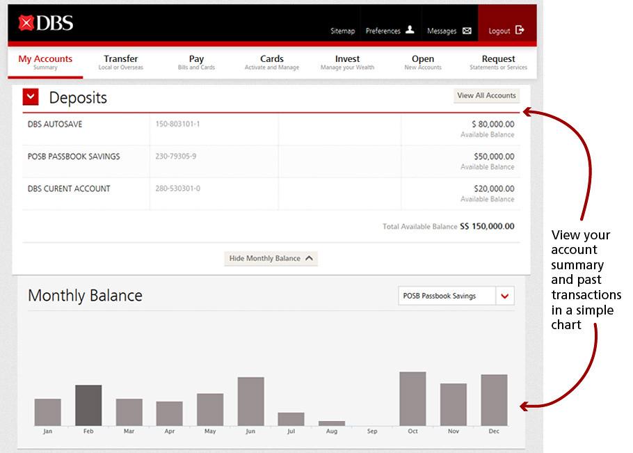
Now, once you log in, you’ll see a snapshot of your account in simple graphics. A coloured bar chart will show how you have proportioned your wealth between cash and investments, loans and mortgages. Illustrative graphics make it easier for the user to make sense of figures. You can see your monthly account balance, your unit trust market value, illustrated in bar charts:
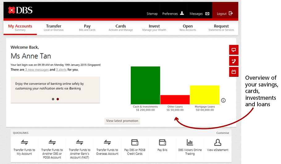
I am very lazy with my banking activities and do not like to scroll and click too much. Visual representations have made it very easy to get information quickly. Upon logging in I can quickly see my overall balance at a glance and I can log out quickly. No more multiple clickstreams just to get some small details:
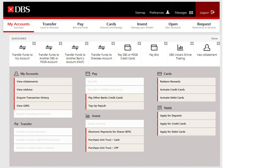
My favourite feature is that the navigation menu has now been moved from the left hand side to the top, across the screen. Now, once I log in to my DBS iBanking account, I can see at a glance all the links to the information I need. The functions on the site have been organised into seven headers on the menu:
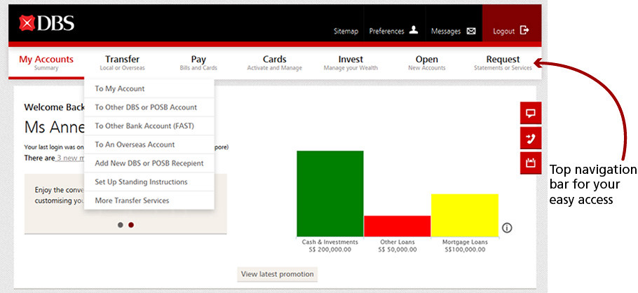
1) My Accounts, which allows one to check balance summary
2) Transfer, so that you can initiate fund transfers
3) Pay, your credit card bills and such
4) Cards, activate and manage your credit cards
5) Invest, manage your wealth here
6) Open, open new accounts here
7) Request, contact the bank for services or to retrieve statements here
Now, for those of us who have more than one account with DBS and can never remember which is for what, now you can customise them with personalised names for easy management:
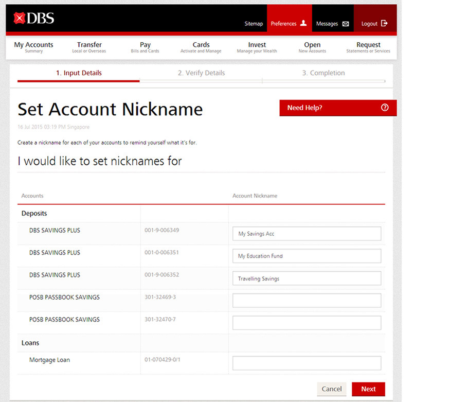
We did that for our son’s savings account, the purpose of which is to save up for his education in future. Asher will be a happy boy when he finds out next time:

You can also save your eight most frequently used transactions by customising your quick links. Just click on “Customise” at the bottom of the page and you can store your eight Quick links at the bottom menu:
If you are unsure about how to use this new website, there’s a short video you can watch. Here it is:
Don’t worry, your existing iBanking login details and settings will remain unchanged.
For more quick tips, go to http://go.dbs.com/sg-newibanking





5