Have you seen the new Singtel logo as part of its impressive rebranding exercise?
But. what does the arc even mean? Is it a frown? Why are there 5 dots? Why does it go from “i” to “e”?
Like you, I thought that the new logo isn’t making too much sense.
Here at Originally US, we believe in No Bullshit Software Development. While we are definitely not a big-boy Creative Agency (we specialize in mobile app development Singapore), I was curious as to what sort of logos our local designers could whip up.
So I called up our designers Yugene Lee & Jeremy Kieran and said, “30 minutes. Singtel logo. Go”.
Here are the results:
Jeremy’s Take
Jeremy is the youngest designer we work with, yet he already has 5 years of client-centric design experience. Jeremy loves working on UI/UX, be it for websites or mobile apps. Jeremy can code websites too!
Design Revision 1
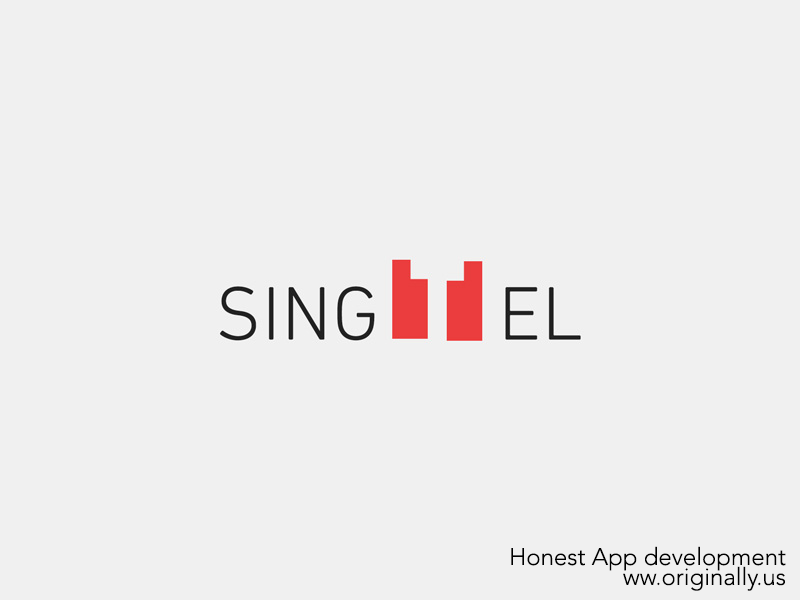
Design Revision 2
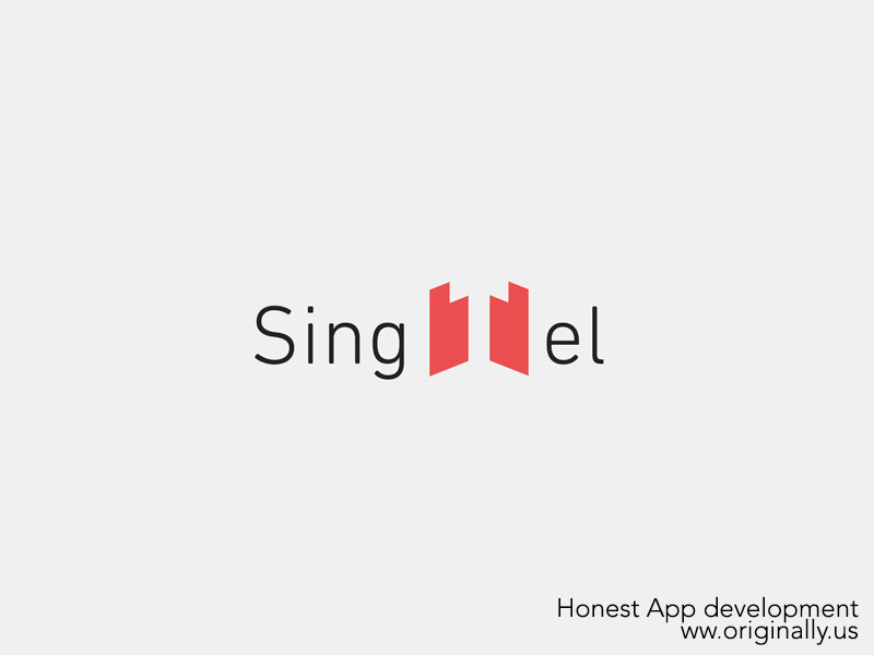
Explanation:
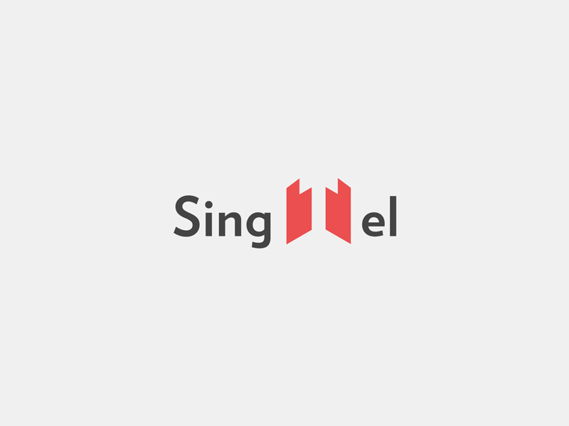
“To make the logo more modern, I dropped the capitalisation and applied some transformations to the red “T” block. But I still felt that it lacked a little oomph.
Final Design
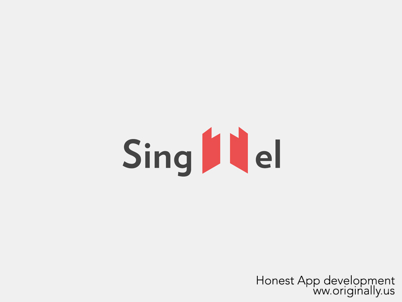
Explanation:
“I exaggerated the perspective of the red blocks which now serves 2 visual functions – the letter “T” and an up arrow. Meanwhile, everyone screams in excitement as positive references to “progressiveness”, “forward-thinking” and “moving up” resonate amongst basically everyone in the room.
Yugene’s Take
Yugene is an experienced Brand, UI and UX designer. He has worked with organizations of all shapes and sizes, from young start-ups to giantic MNCs. Yugene specializes in working with our clients to understand their company values and objectives before starting work. Yugene can even code websites!
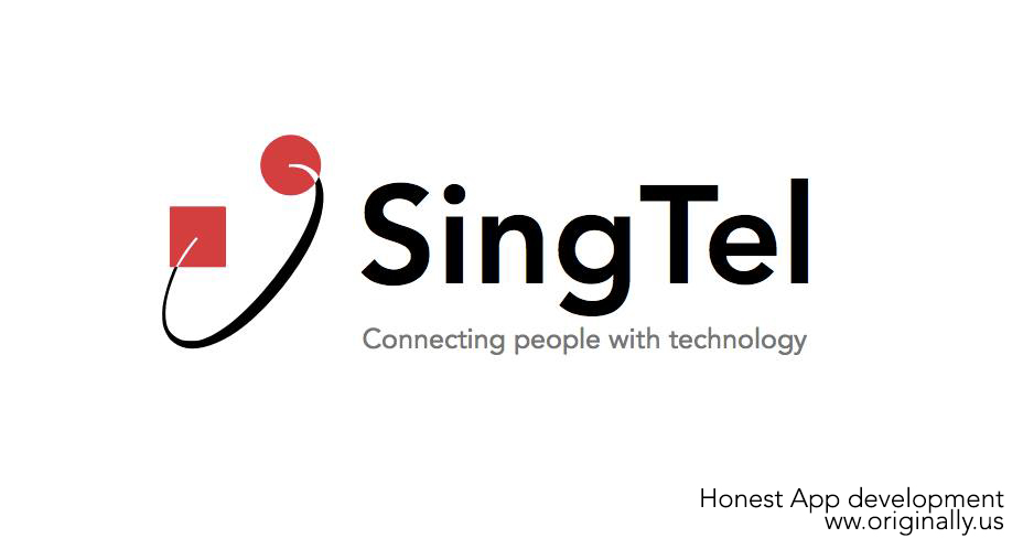
Explanation:
“Companies usually rebrands if they do not have a rich heritage or identity. However, SingTel’s logo is already well recognized. What they need is a little readjustment of their logo to reflect their new brand commitments and mission.
SingTel is not just a telco. They are a technology company that connects with people. By reinterpreting the square symbol as “technology” and the round symbol as “people”, I was able to adjust the existing logo to represent these new ideas.”
Disclaimer
We are not related to Singtel nor are commissioned by Singtel to develop their corporate logo. This was just something we came up with one lazy afternoon.




![Cantopop star Jordan Chan Stop Angry Tour in Singapore is happening this May 2019 [see tickets here] Cantopop star Jordan Chan Stop Angry Tour in Singapore is happening this May 2019 [see tickets here] - Alvinology](https://media.alvinology.com/uploads/2019/03/Jordan-Chop-Stop-Angry-Tour-in-Singapore-1024x538.jpg)

Are the 2 red blocks in Jeremy’s Design Revision 1 intentionally uneven? I like the first revision, but I would personally align those two blocks and then make the “SING” + “EL” middle vertical align with respect to the red blocks. I prefer that against the final revision – the text and the “T” red area felt a little disjointed – I initially read it as a company playing on the word “single”.
I do like Yugene’s response, keeping with it’s original logo and just modifying it a bit. I might make it a little more flat ui in feel, but that’s just an idea.
Just as bad. Honestly ur 30 mins deadline is an insult to ur poor designers
not any tom can design, the designers need typography lessons
You had 30 minutes and didn’t even fix the kerning?
These are boring ideas.. you can align letters as much as you want but if your idea is weak, there’s no point
I liked Jeremy’s dwsign and I think that it’s much better than the one singtel came up with!!
I rather you didn’t do it
Please take this down, even poorer design and rationale.
With such a “stink” brand to work with, you guys did great.. Welcome to from i to e.
I agree w the rationales espoused by the two designers. To the haters above, any two-year old will appreciate that the above drafts/concepts have some sense in it.
The new Singtel logo has no sense whatsoever – and as shown historically, they have done poorly in competing in overseas markets where marketing plays a larger role in its success.
Its such a bad logo. Seperating the word. I only see singel. Not even close to being better. In fact, singtel new logo is better because i believe the circle is to represent communication waves in abstract.
Given 30mins, these 2 designs are on par, if not better, than the one designed by Ogilvy on a multimillion dollar rebranding contract.
Being in the line of advertising myself, it’s an insult to get any designers, junior or senior, to conceptualize and design a logo as a branding exercise, and your header ‘… The Result’… well, the resulting logos came off just as bad, if not worse than the one we’re all criticizing on.
You can find so many mistakes in Jeremy’s logo. The understanding of typeface is not strong and the logo just didn’t convince me that it’s a FA. The kerning wasn’t intentional I guess, they looked so loose it doesn’t communicate to me enough that SingTel is a corporate business in providing tele services. If I didn’t know SingTel is a telco company, I’d have thought they’re selling doors or contractors who are specialised in building.
Yugene’s rationale was acceptable but logo not impressive at all. If SingTel were to come to me with a multimillion contract and that’s what I have on hand, they’d have tore my face into pieces.
Their creativity have suffered in your hands because of your irresponsible, unfair and disrespectful act in requesting them to design a logo in 30mins. Did you write this article in 30mins?
Not to defend their new not-so-impressive-its-actually-pretty-ugly-and-boring logo but thinking it through, it could have meant that the letter ‘I’ represents us people, connecting to each other electronically, represented by the letter ‘e’, which also sends a subtle message that SingTel connects us to the e-world of today.
My 2 cents worth.
(Regarding Jeremy Kieran’s take:)
Weak attempt. Finishing is sloppy. Revisions merely skewed, chance case and font style (bold). Might as well just present the final take from the start? Issues on kerning, alignment, type choice already mentioned by early commenters.
I initially noticed the 2 thumbs up forming the ‘T’ which could be creatively explored, but apparently that was not intentional.
If the design and rationale has come from the writer (or anyone not in the arts and design industry), I would have considered it witty. As someone with 5 years of client-centric design experience, this is pretty embarrassing. Yes, even considering the 30-minute deadline. To me, the young designer sounded arrogant. I thought Yugene’s rationale at least addressed Singtel’s brand recognition.
In the meantime, take a look at what Canadian Designers came up with (kickass designs)
http://www.the150logo.ca/
Either do it better or don’t do it at all.