I remember when Rachel and I were planning for our wedding five years ago; a lot of the sourcing for vendors was all done at physical shops and through face-to-face contacts or referrals from friends.
Since then, a lot of stuff can now be done online or even on mobile. Five years ago, I could never have envisioned a day when I could use a mobile app to grab taxis or find part-time domestic cleaners. Yet this is the reality today.
The same goes for planning a perfect wedding.
What if I share with you that there is a website that allows you to plan and customise your perfect wedding online, in the comfort of your own home?
Enter Bridestory.

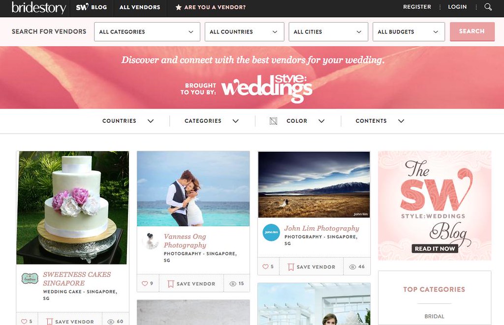
Established in April 2014, Bridestory is a leading online wedding vendor which has a strong social media presence among Indonesian and international audiences. Bridestory’s main focus is to build an advanced wedding platform that connects engaged couples with wedding vendors around the world.
Why Bridestory makes so much sense
You only do it once in a lifetime and you want to do it right. However, precisely because most couples only get wedded once, wedding vendors do not get much repeat business. As such, referral may not be that relevant, as it will often be based on that one consumer experience.
Also, the price difference and quality varies vastly from one vendor to another. Take a wedding photographer for instance; how do you tell an amateur from a professional? What is the price difference you are willing to pay for better quality?
Bridestory helps to solve all these issues by offering vendor listings with transparent pricings, as well as peer reviews.

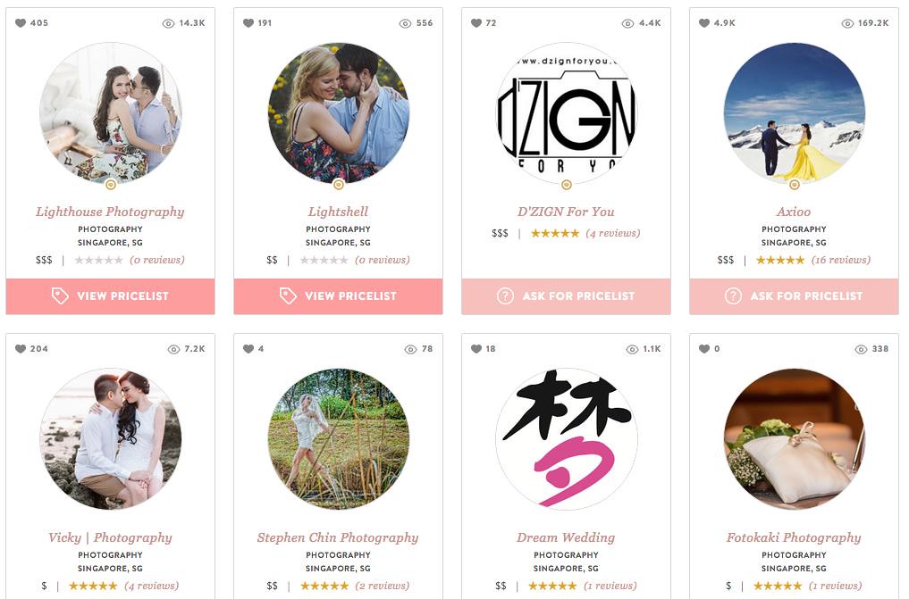
A search under their photographer category revealed a variety of vendors, each with reviews, pricing and even a beautiful portfolio page for you to sieve through their past wedding projects.
Without a pushy salesperson pressuring you to sign up for a hefty wedding photography package, you can explore each vendor slowly in the comfort of your own home, browsing through their portfolios and selecting what make sense for you.
Beautiful layout with intuitive site navigation
If you frequent e-commerce sites, you will be familiar with the messy layout and confusing site navigation on some of the largest shopping sites like Amazon, Taobao and Gmarket. There is a reason for this, as it encourages impulse buys and purchases where you are confused over how much you are actually paying for the product.
At Bridestory, they understand that shopping for a wedding is part of the journey for a perfect wedding.
The site navigation is simple and easy to get information. Moving from one point to another is like flipping a beautifully curated magazine. The user experience is pretty good.

Don’t take my words for it. Visit the site yourself to try it out!
If you are getting married or helping someone to plan a wedding, do check out Bridestory to see if they can assist you in your journey towards that perfect wedding. 🙂


![[Giveaway Alert] KFC Singapore to Kick Off 2026 With 4 New Asian-Inspired Sauces, including Mala and White Curry [Giveaway Alert] KFC Singapore to Kick Off 2026 With 4 New Asian-Inspired Sauces, including Mala and White Curry - Alvinology](https://media.alvinology.com/uploads/2025/12/WhatsApp-Image-2025-12-21-at-2.58.02-PM-2-110x110.jpeg)


