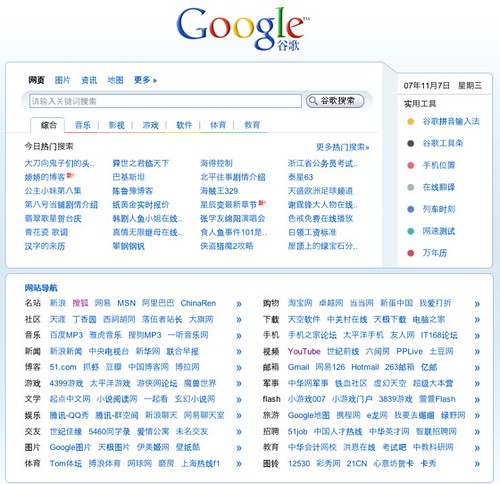
That’s the impression I seem to get when surfing Chinese websites. It was something we were trying to avoid when creating omy.sg as our feel is that Singaporean web users (who are more familiar with surfing the web in English) will be adverse to a cluttered site architecture.

However, it’s interesting to note from this article on TechCrunch that even Internet giant, Google is revising to a cluttered layout to suit the Chinese’s taste in order to gain a larger chunk of the China pie.
Are you a bilingual web surfer?
If so, which layout do you prefer for your chinese content? A cluttered one like xin.sg or a cleaner one like omy.sg?
Technorati Tags: xin.sg, omy.sg, google china, bilingual website, china internet, alvinology, yahoo china, techcrunch, web trend, site architecture


![[Photos] Who is Wendy Lim (林婉丽)? [Photos] Who is Wendy Lim (林婉丽)? - Alvinology](https://media.alvinology.com/uploads/2016/03/wendy-lim-collage.jpg)


Geez, why would Chinese prefer a cluttered layout? One Chinese word = one pictogram. Many many Chinese words, many many pictograms!
My head hurts.